Redesigning Flux
A case study into the redesign of a tax preparation web app for investment fundsDue to the sensitive and proprietary nature of this product, certain information has been withheld and modified. This product will be referred to as Flux and the client as Kappa.
Project Backstory
Flux is an industry-leading web application used by tax professionals to transform the financial records of many of the largest US investment funds into tax forms ready for filing with the IRS.
Since being launched in 2013, Flux's comprehensive features and user experience launched it ahead of competitors in the asset management space. Until 2016, Flux had been limited to only servicing partnerships (LLPs, GPs, LPs), but its success secured funding to expand the app to support more entity types, like REITs and RICs.
With this growth beyond partnerships, Flux had outgrown its original user experience. New modules and increasingly advanced features were added as the app grew to satisfy the complex needs of these new markets. This expansion further increased the complexity of the system, put stress on the UI, and fragmented the user experience.
To save Flux from its own success, it needed an end-to-end redesign.
Identifying the goals & challenges
I conducted interviews with over 15 existing users and performed a full UX audit to understand the key issues to address in a redesign.
Inaccurate Information Architecture
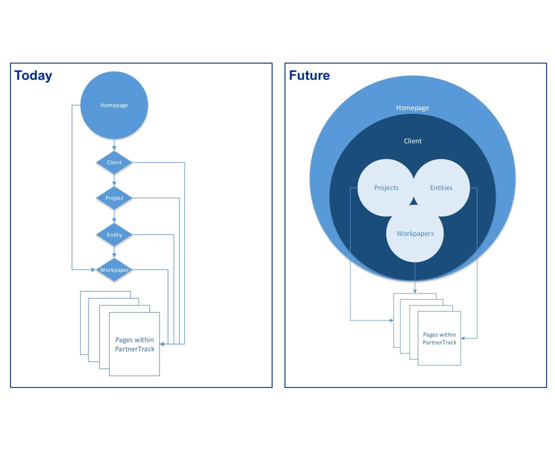
With the introduction of new entity types, features, and pages, the underlying information architecture became inconsistent, unorganized, and out-of-sync with users' expectations of the business process.
Unusable Navigation
The original navigation had many issues:
- Flux followed an unconventional tag-based navigation pattern that was overly-complex and unfamiliar to users.
- The UI component for navigation was not designed with scalability in mind, resulting in a very linear, inflexible, cumbersome, and broken navigation experience.
- Many areas within the app lacked meaningful navigation to contextually connect relevant items and pages.
Difficult Findability
In an application with an ever-increasing amount of records, users were struggling to find what they needed. Search results were unorganized, uninsightful, and difficult to distinguish, even when users entered the right criteria.
Ineffective Homepage
The old homepage was a bottleneck that lacked a clear content strategy, resulting in a page with an overwhelming amount of content, yet not a lot of substance. Users were often lost without a clear focus of what to do or where to go. Every user I studied would bounce through it as quickly as they could.
Outdated Visual Design
In the years since its launch, web design trends had shifted away from Flux's original skeuomorphic theme. The Firm had also recently updated its global design guidelines with new colors, fonts, and principles to be included in a UI redesign.
Gaps in UX Quality
Many accessibility and usability concerns were not addressed during the development of the application, like proper HTML semantics, missing ARIA roles, keyboard access, load indication, deep linking, state retention, validation, and language consistency.
My role in the product
I was the Lead UX Researcher, UI Designer, and UX Engineer on this project, providing end-to-end UX services - from strategy and research, to design and development. I worked alongside 15 Users, 2 Full-stack Developers, 1 Junior UX Designer, 1 QA, and stakeholders from 8 teams throughout this process. I was personally responsible for the following:
Product Strategy
I initiated the discussion and persuaded financial stakeholders to commit to a redesign. I did this through a series of pitches where I shared the scope of the problems, recommended actions, proposed deadlines, and provided valuation through ROI estimation.
Throughout the process, I communicated the vision and coordinated deliverables across several dependent project teams.

UX Audit
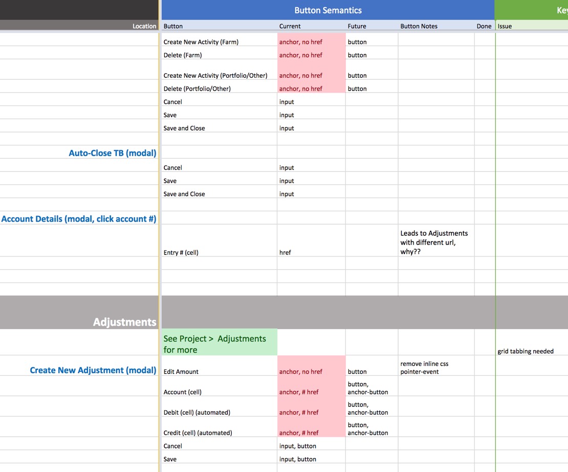
I performed an end-to-end UX analysis of the application to identify inconsistencies and gaps in the UI design, interactions, front-end code, usability, and accessibility. My findings were documented, shared with business analysts, and turned into backlog requirements.
User Research
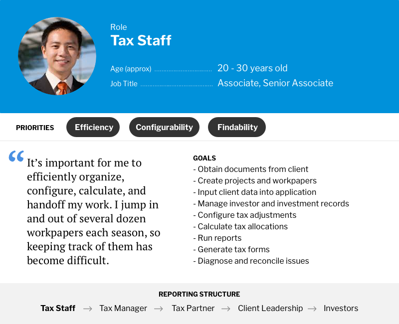
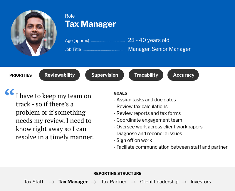
I interviewed and observed existing users to understand and validate their business process, needs, and frictions. The insights were captured through user journey maps, task analysis documents, and personas.
Information Architecture
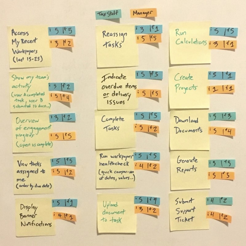
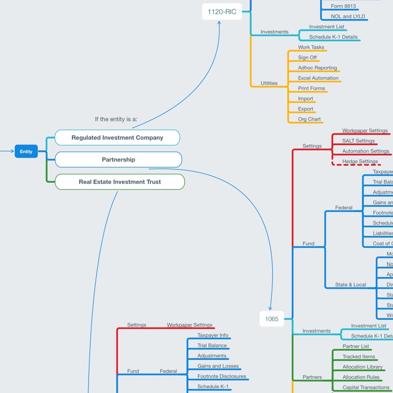
I facilitated card sorting activities to validate a common mental model of how users organize the application’s content into meaningful taxonomies. The findings were used to restructure the navigation, rename ambiguous content, and provide more sustainable relationships between pages.
Wireframes & Prototyping
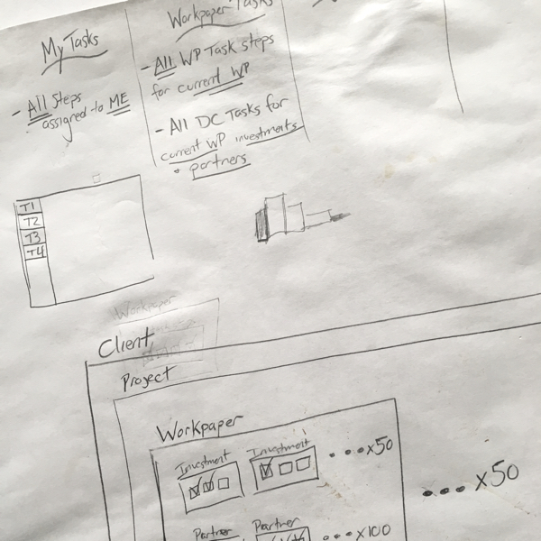
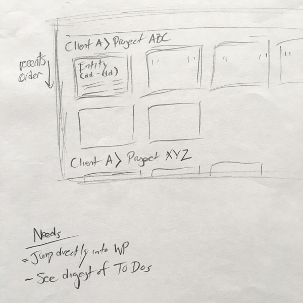
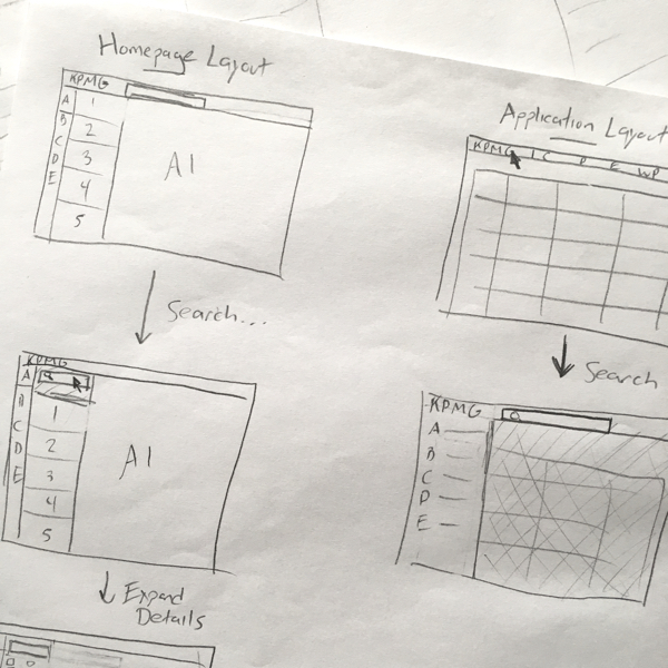
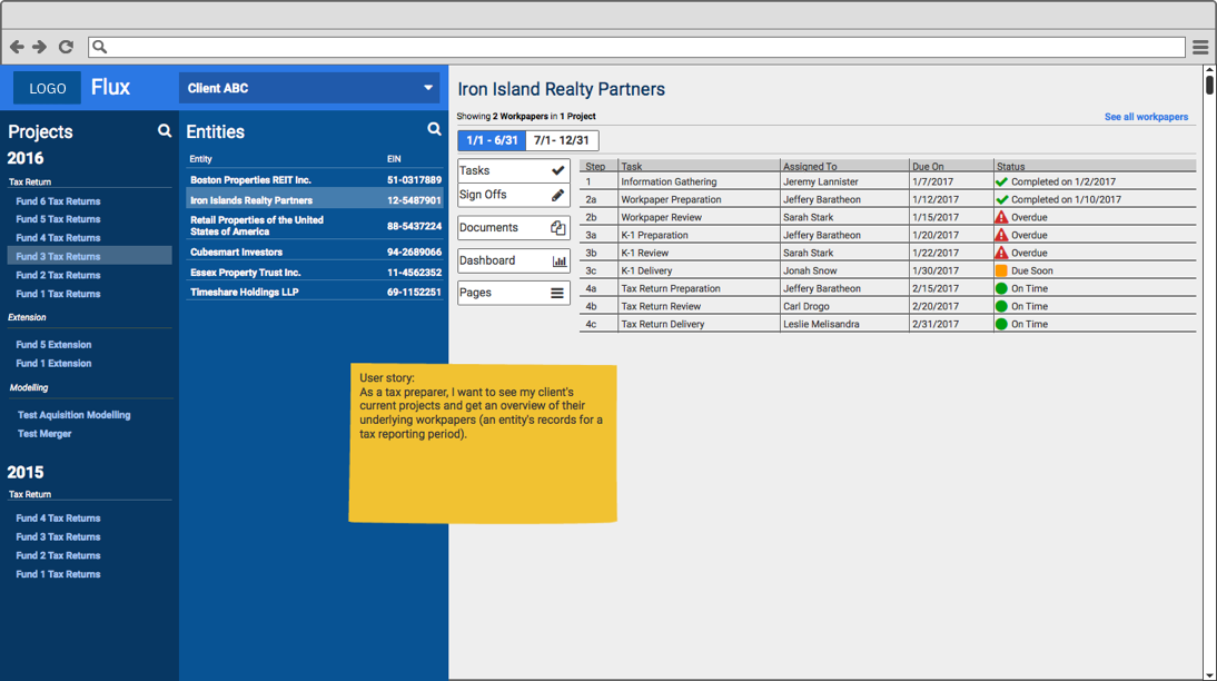
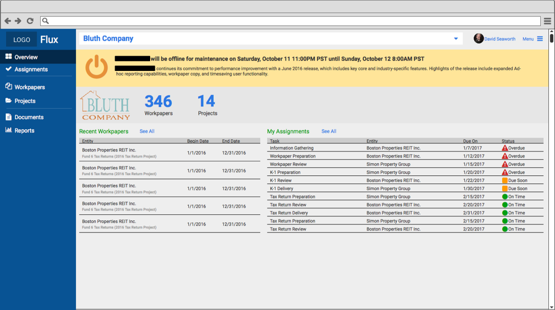
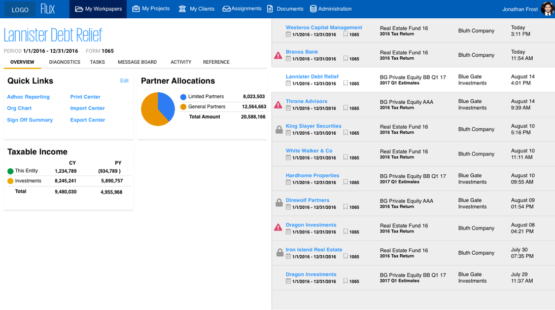
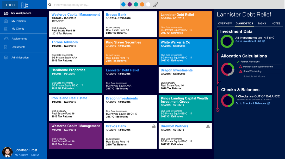
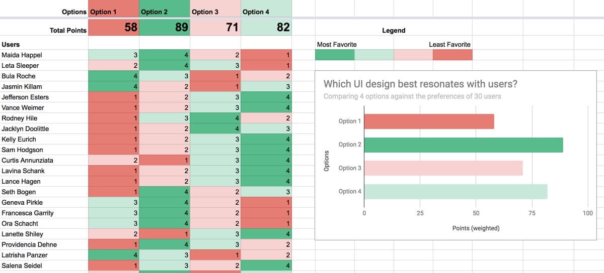
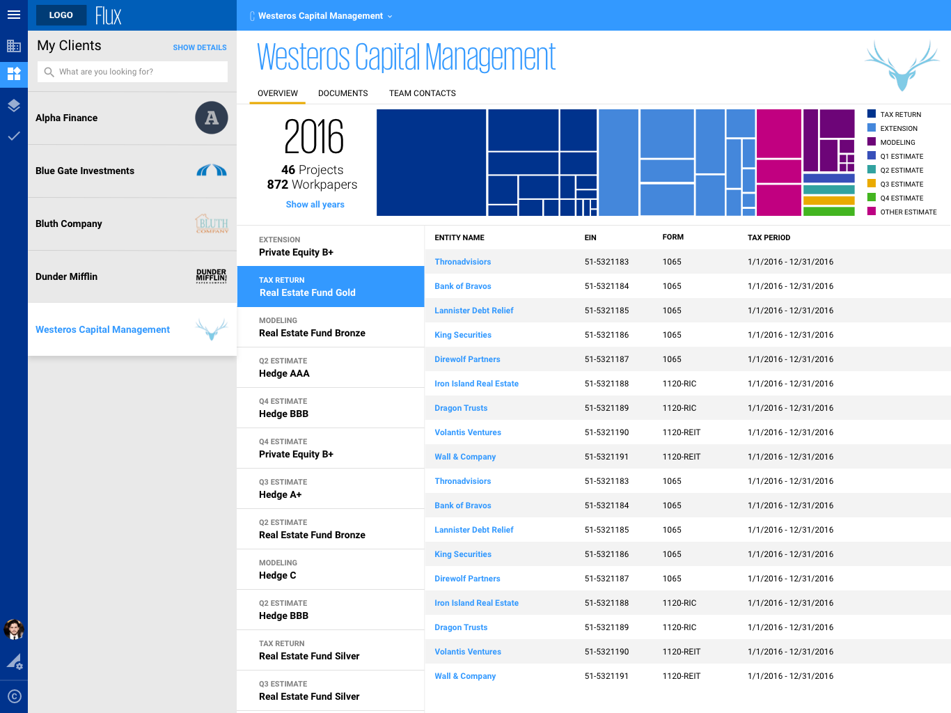
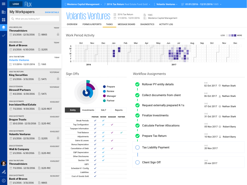
I designed a variety of wireframes and mockups through several iterations of feedback with users and created interactive prototypes to demonstrate the user journey and implement controlled A/B testing.
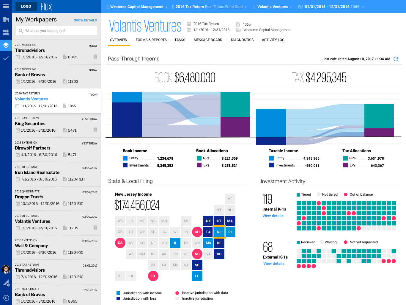
Since the existing app was heavily reliant on data tables to present information, many of the users I spoke to had a hard time picturing the content any other way. To demonstrate the art of the possible, I presented a variety of design concepts featuring cards, lists, and data visualizations, which all received positive reactions. While presenting these ideas, I encouraged users to think outside-the-box and share their ideas on how to represent meaningful information. I tested these insights through continuous design iteration and user testing, leading Flux toward a new UI finely curated to the content and navigation most beneficial to users.
Tools used for design:
- Whiteboards, Pen & Paper
- Balsamiq
- Axure
- Sketch
- Invision
- HTML, CSS, JavaScript
UX Engineering
I utilized the best practices of HTML, CSS, and accessibility to develop new responsive layouts and components to support the newly designed areas of the application.
I engineered the interaction design by implementing custom behaviors and animations to enhance the fluidity and quality of the user experience.
After a thorough analysis of legacy rule-sets, I removed thousands of lines of CSS, and refactored the existing stylesheet using SCSS.
Skills used for development:
- HTML
- CSS (SCSS)
- jQuery
- WAI-ARIA
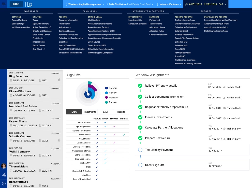
Identity Design
I aligned the UI with the firm's new global branding guidelines through the use of branded colors and typography. The new UI theme was a complete overhaul of the existing application, resulting in a clean interface that prioritizes content, state, and behavior over decoration. I also designed a new logo that symbolizes the narrative of the application and the business it serves.