Evaluating Tax Strategies
A case study into the design of a real-time presentation and business enablement toolDue to the sensitive and proprietary nature of this product, certain information has been withheld and modified. This product will be referred to as Prism and the client as Kappa.
Project Backstory
Big corporations want to become more tax efficient to increase their long-term sustainability and revenue. Without in-house tax knowledge, they turn to corporate tax specialists to guide them towards the right strategy.
In order to determine the right tax strategy, it’s essential for the tax specialists to assess the company's current state of affairs and understand their overall business goals. With this information, opportunities can be identified among the company’s strengths and weaknesses to create an action plan curated to their needs.
To do this, lead partners at Kappa meet with the company’s leadership for a workshop to discuss reimagine their tax strategy and discuss their business needs. Our goal was to build a tool that augments the facilitation of these workshops and enables new business engagement.
Identifying the goals & challenges
I conducted interviews with the tax professionals who run these workshops to better understand their process, the workshop goals, and the dynamics between the parties in order to empathize with their needs.
A Leader in Technology
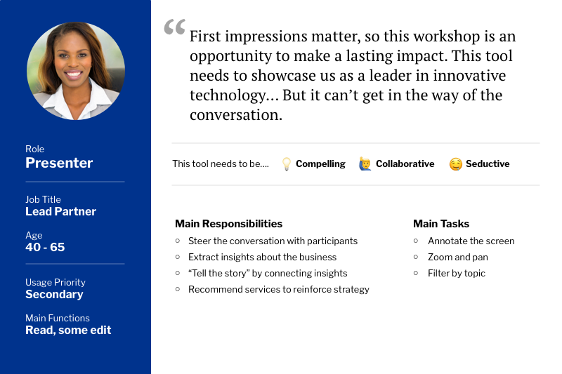
The workshops until this point were performed with whiteboards and sticky notes, which failed to demonstrate our technological capabilities. By facilitating these workshops using an collaborative presentation tool, it communicates a message to our potential clients that we are a leader in innovative technology.
Efficiency and Ease of Use
When designing a product to assist in an existing process, it’s crucial that the product itself doesn’t become a source of frustration. Efficiency became a guiding design principle to ensure usability, prevent friction, and ensure adoption.
Digitizing an Analog Process
The current process lacked organization and insight, so we did not want to replicate it outright. We analyzed the business process, workshop dynamics, and information architecture to reimagine the user experience and craft a meaningful interactive tool specialized to the content, message, and audience.
The Magic of Showmanship
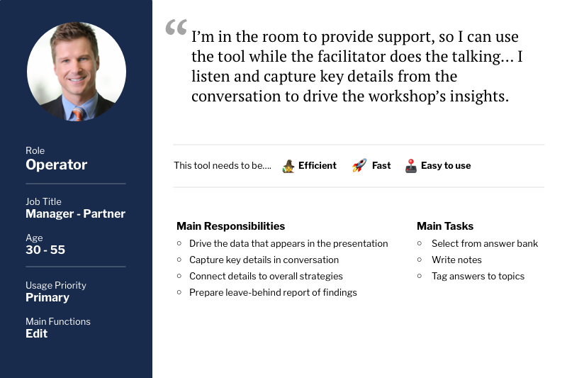
Understanding the dynamics within the meeting room challenged us to create a tool that could be operated in real-time with ease. It was vital for the Presenter to lead the conversation and engage the participants, while another person in the room captures notes and operates the tool.
My role in the product
I was the Lead UX Researcher, UX Designer, and UX Engineer on this project, providing end-to-end UX services - from strategy and research, to design and development. I worked alongside 6 Users, 2 Full-stack Developers, 1 UX Director,and 1 Business Analyst throughout this process. I was personally responsible for the following:
User Research
By interviewing tax leaders who have facilitated or aided in these workshops, I was able to understand their processes, goals, and needs before, during, and after an assessment - as well as the frictions they currently face. I also focused on the dynamics within the meeting room and the expectations of the client participants.
Design Thinking
I validated and analyzed my research findings to outline the existing process and discover opportunities to enhance it through the introduction of a digital tool.
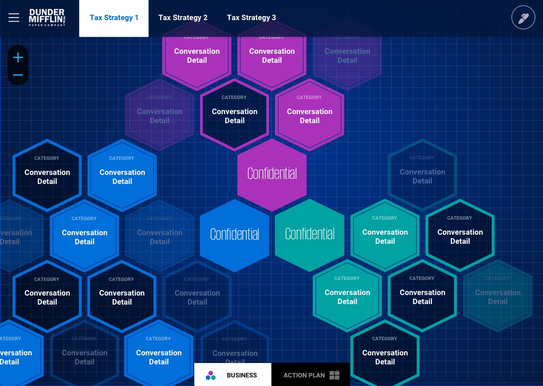
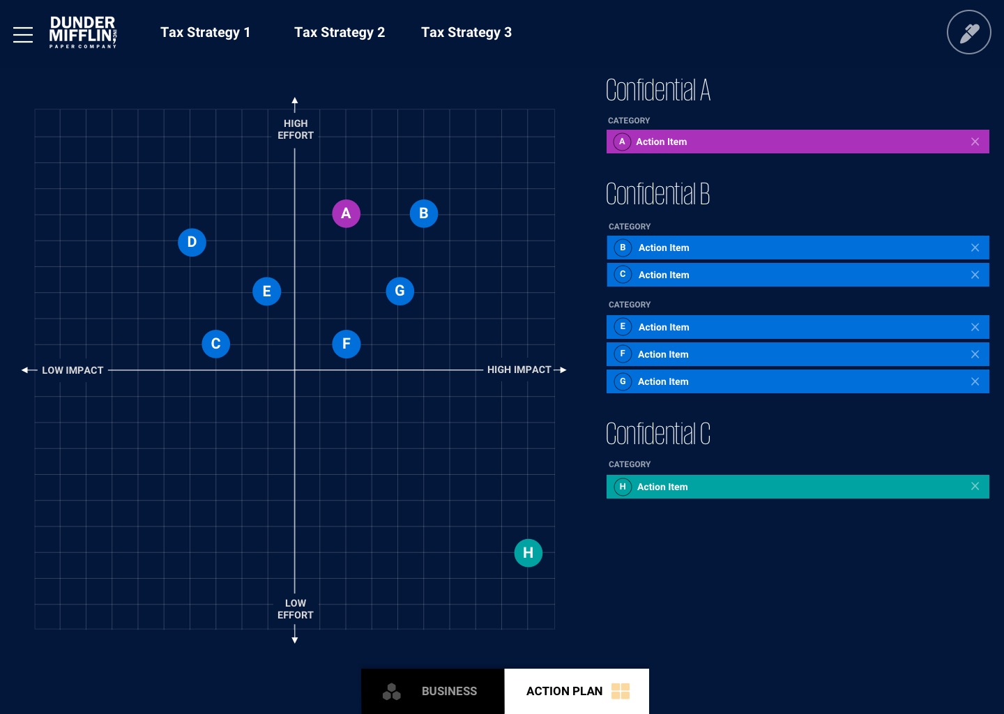
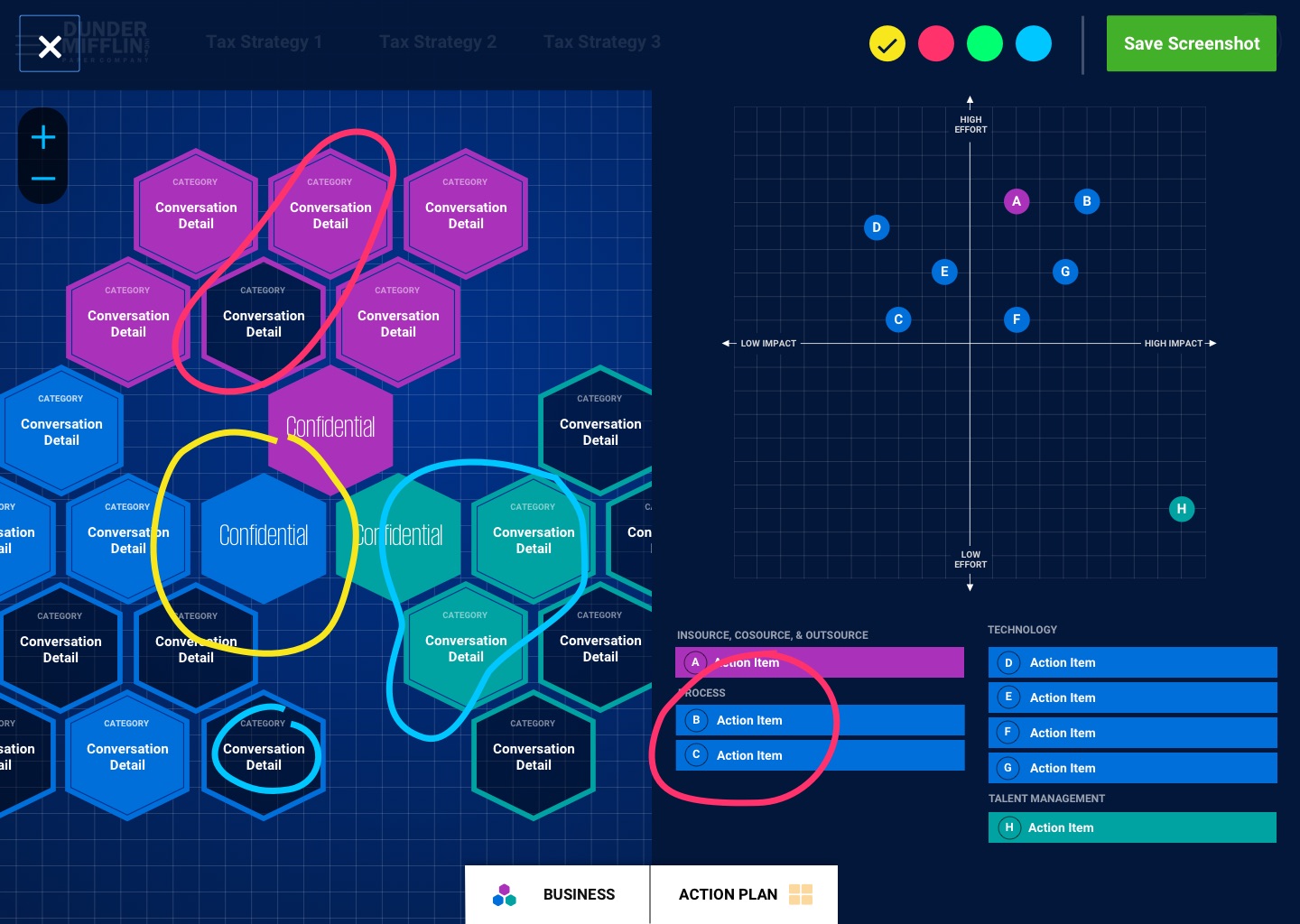
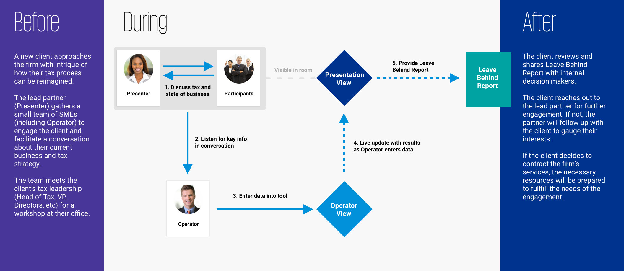
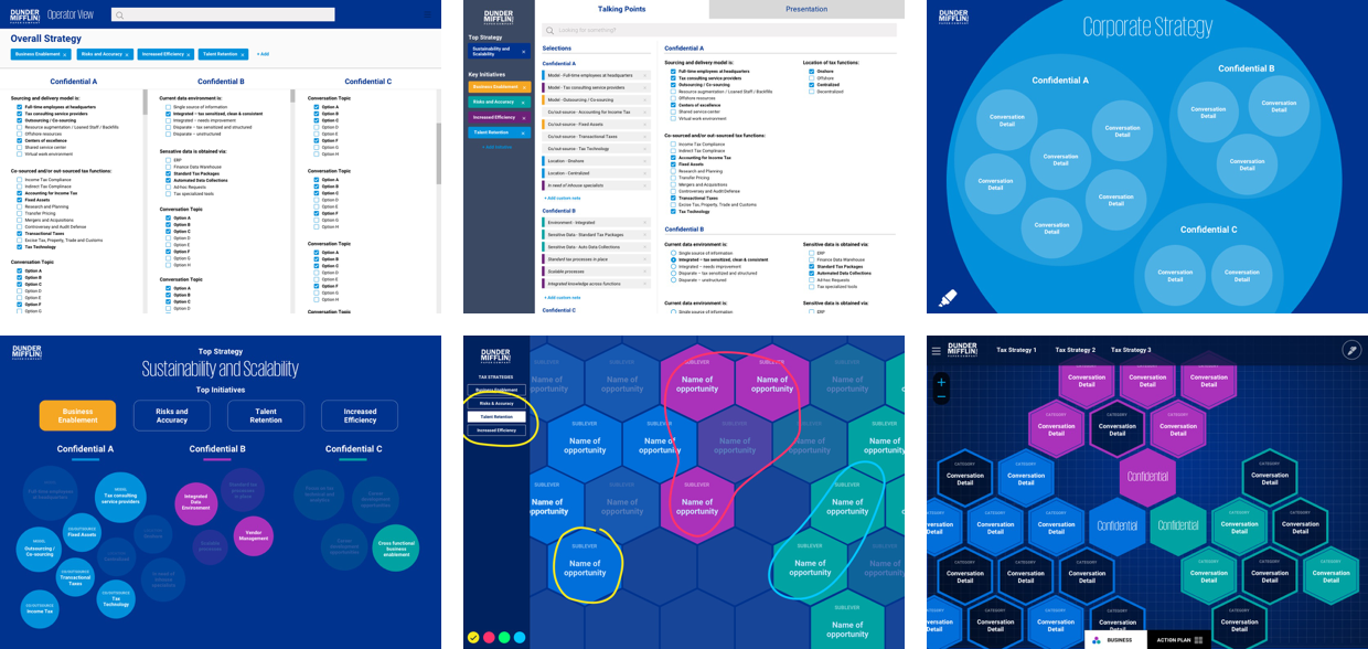
I orchestrated a Wizard of Oz strategy, in which an Operator and Presenter work together to bring the experience to life. As with the existing process, the Presenter guides the conversation to solicit answers from the Participants. While this happens, an Operator uses the tool to capture and configure key talking points through an efficient “Operator Panel”. The data gets published in real-time to a polished “Presentation View” visible to the audience for the Presenter to interact with and further guide the workshop.
Information Architecture
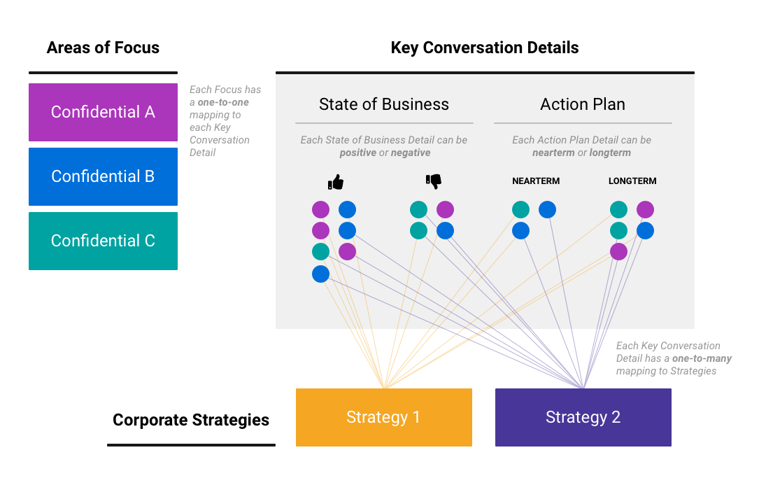
The workshop follows a framework of proprietary knowledge to swiftly identify a company’s operational strengths and weaknesses, connect their corporate strategies, and advise them on ways to improve.
To ensure these concepts were built into the design, I mapped out their relationships to each other and their significance to the presentation. After validation, these findings became essential to the layout and navigation.
Task Analysis
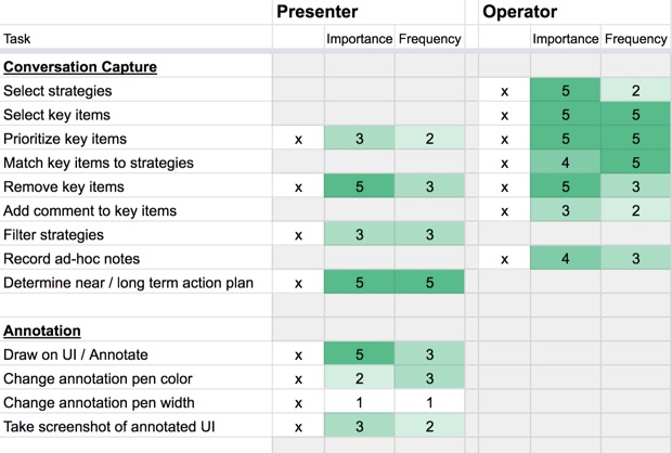
To design separate interfaces for both Presenters and Operators, the boundaries of their needs and responsibilities had to be established. We compiled all the possible tasks a user might take within the product in order to validate the usage of each task for each user.
With this knowledge, I was able to design UIs that prioritized highly important and frequently used tasks, excluded unneeded functionality, and organized the user experience to be simple, meaningful, and efficient for each user.
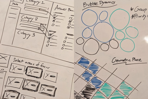
Wireframes & Prototyping
Iterating from low-fidelity to high-fidelity, I designed and presented UI mockups and interactive prototypes for continual validation from users, stakeholders, and engineers.
At the onset of this project, users imagined this would be a survey tool. As I presented ideas, I was able to visualize and suggest alternative design concepts based on the user research. Through validation of the mockups, the user's perception quickly evolved from a survey into an interactive presentation with seperate Presenter and Operator UIs.
I built interactive prototypes to demonstrate and validate the flow of this process. As the designs became increasingly higher fidelity, I was able to explore a number of design directions, test their implications, and collect feedback from users. The feedback brought the product ever-closer to a "cutting edge" and "high-tech" look-and-feel, eventually leading to the final UI.
Tools used for design:
- Whiteboards, Pen & Paper
- Sketch
- Invision
- HTML, CSS, JavaScript
UX Engineering
Due to scheduling conflicts, I did not join the dev team until a majority of the app was built. The dev team was primarily focused on functionality and, without a UX Engineer in their ranks, built a UI that lacked the refinement of the final mockups. The front-end code was unsemantic, unresponsive, inconsistent, and unnecessarily reliant on 3rd party libraries for basic functionality.
After a thorough analysis of the existing Angular app, I refactored every UI component. Most of my work was in restructuring the HTML layout to use CSS Flexbox and Grid, developing an SVG-based hexagon layout, reauthoring the stylesheets with SCSS and BEM, utilizing semantic and accessible HTML elements, and implementing web animations.
Skills used for development:
- HTML
- CSS (SCSS)
- SVG
- JavaScript
- Angular